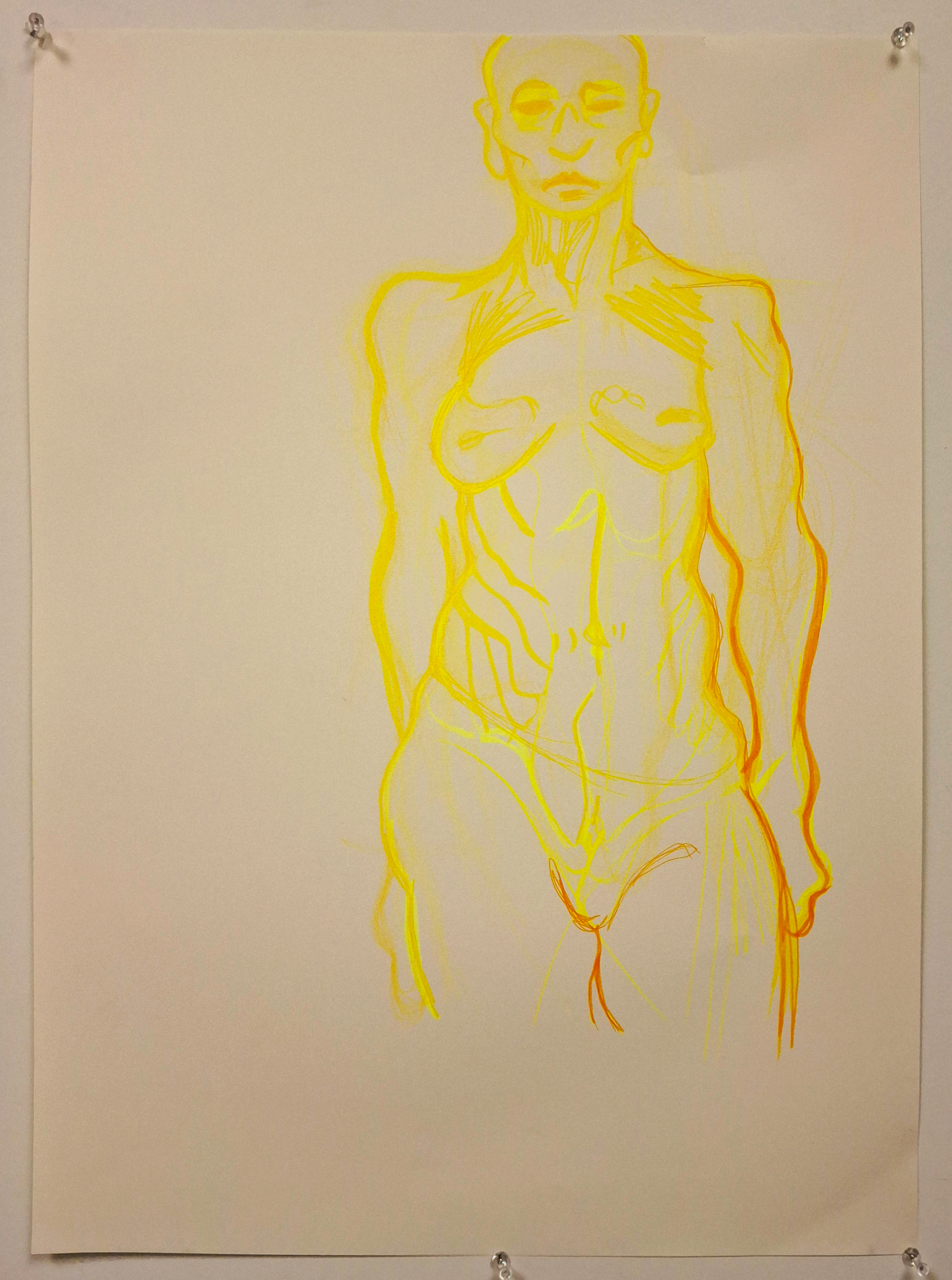
The use of color in this piece was applied, via a happy accident, to simulate a more shadowed end result. I have found that using highlighters to sketch out my figures before going over them with darker markers toward the lower right area. I like seeing the sketch from underneath the ‘final’ image. This piece was a bigger version of a Morpho drawing.
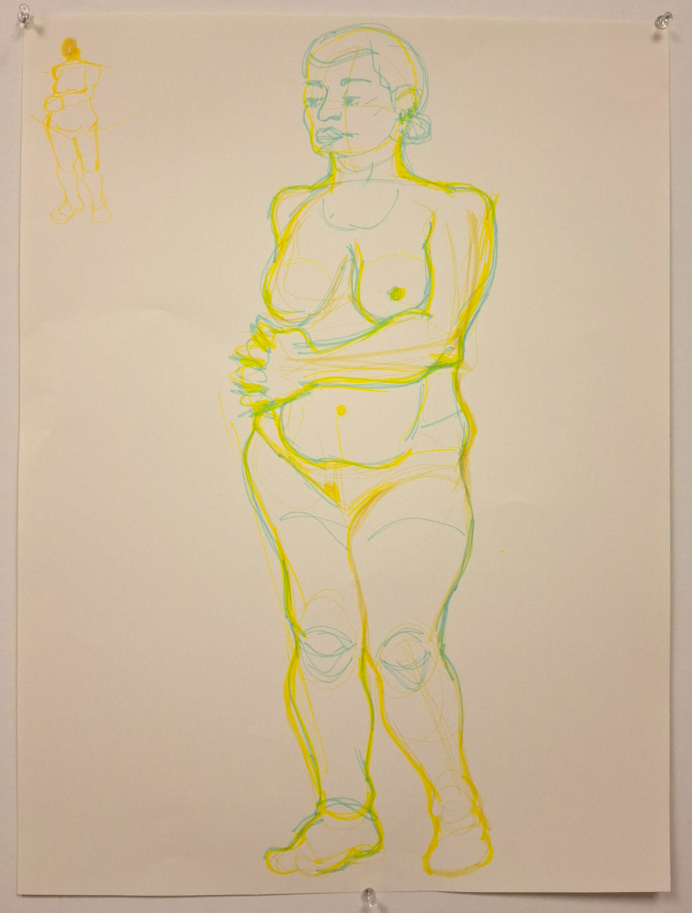
This piece was done in Figure Drawing II with a new model. I have been experimenting with markers this semester since I know the materials extremely well, and I missed having color in my art pieces. I am always looking to refine my figure studies and knowledge of the human body in art. My professor, Mel Tychonievich, suggested that I do a thumbnail of the pose to work out the tremors in my hands on the first run.
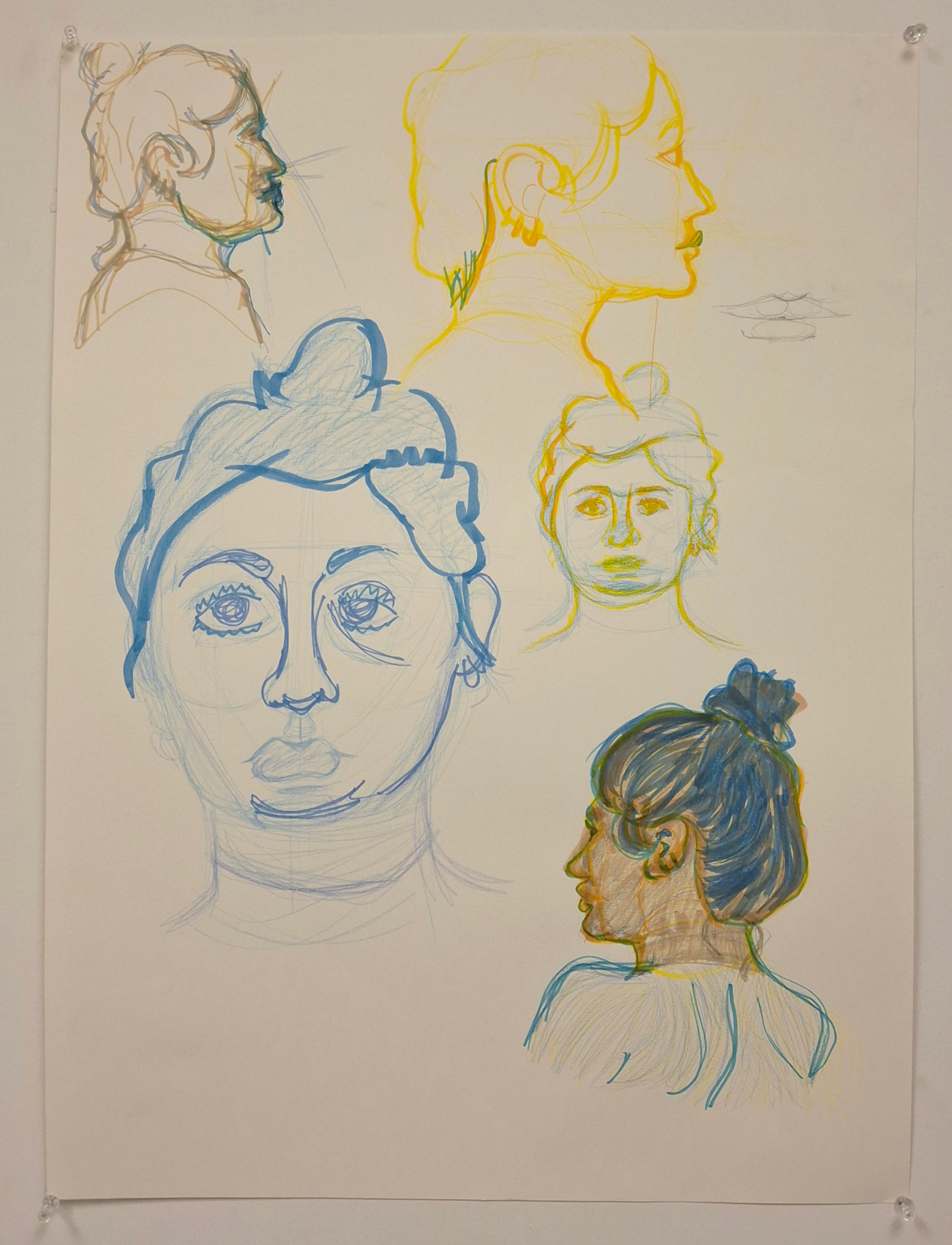
I asked my Figure Drawing professor, the aforementioned Mel, suggested submitting pieces that had tonal variations and chroma differences. While I am unsatisfied with the blue head, the combo busts of yellow and blue turned out well.
I am happy with how the brassy sketch comes through for the upper left, I am very satisfied with the yellow head since it almost feels like it glows. The blue pencil and yellow marker head ended up okay, and the bottom right piece was more of an exploration of the colors at my disposal.
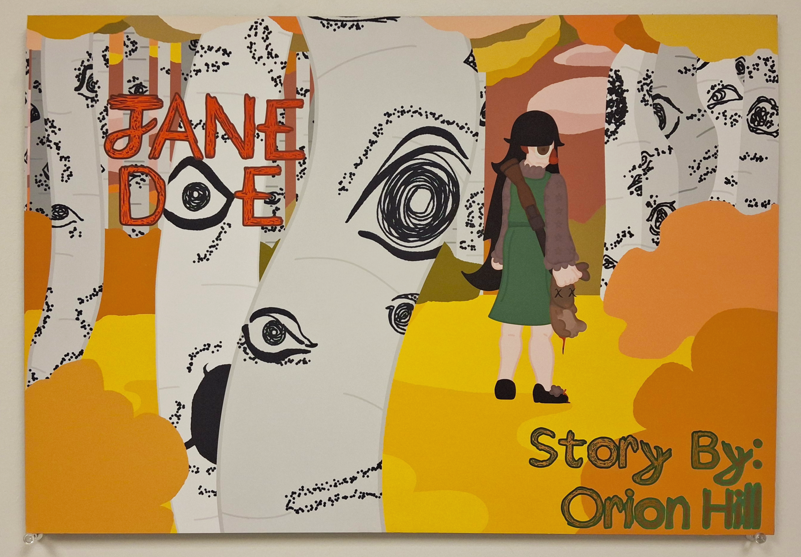
This piece was for an assignment in Illustration & Sequential Design- after making my character, Jane Doe, we were told to make a concept art piece to show off the character and story. I chose to show Jane in a forest holding a rabbit she shot with the gun on her back with wide eyes. She isn’t smiling to show that she has a very creepy atmosphere around her. Jane is also staring directly at the viewer to unsettle the audience.
The reason yellows, pinks, and oranges were chosen was to show that this series, while being set in Missouri, won’t exactly be realistic to the furthest extreme. Jane is a cannibal who eats her crushes, but the cartoon style pairs well with the pink sky and clouds. The rabbit has X’s over the eyes and blood dripping from its body to remind that this will be a gory story.
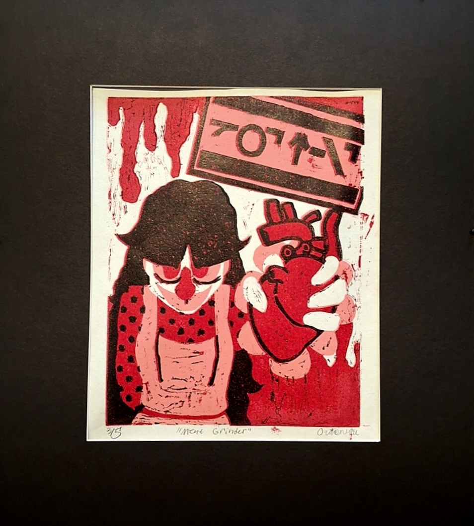
"Meat Grinder" is a piece that was sketched with pencil, cleaned up digitally, flipped-slalsh-printed, and then transferred onto the linoleum block seen below via frottage. It depicts Jane holding a realistic-shaped human heart out at arm’s length toward the viewer, with a sign in the back reading “GOT MEAT”. It was done in layers of white, pink, red, in black. The sign was modeled after parental advisory signs
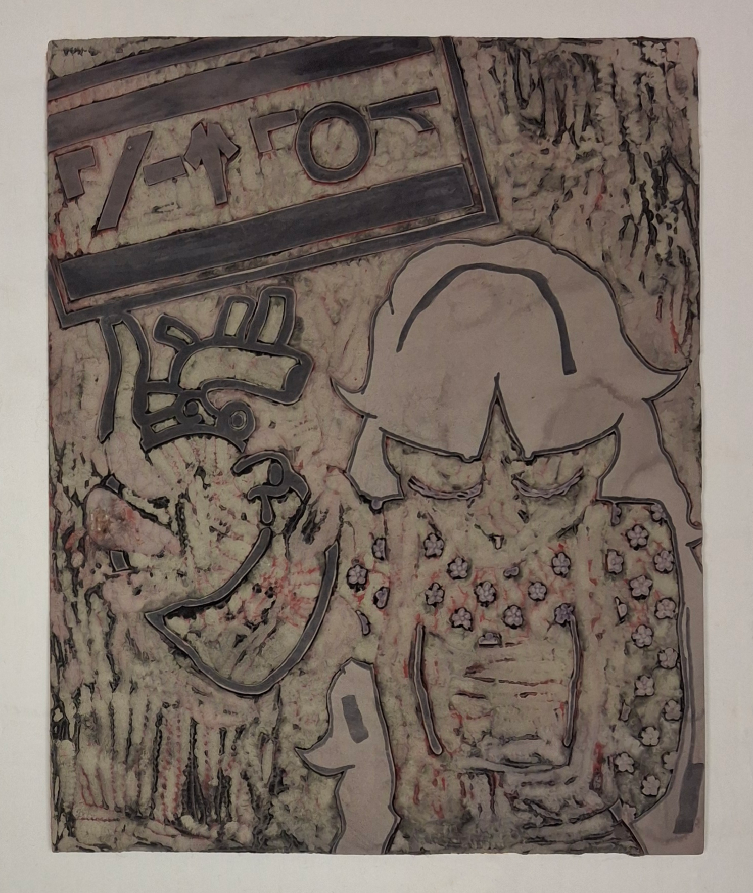
“Meat Grinder, Linoleum” is the linoleum left over from my “Meat Grinder” prints. Why show a linoleum block? It still holds the same artistic intent and landing as the piece it created, and seeing the ‘in progress’ of art is always a treat. I am proud that the layers are still technically visible even after being carved, washed, and reprinted.
I find that showing the in-process aspect of art just as important as showing the finished product. It makes art seem 'more real', as if the imaginary wall seperating an artist from someone who looks at art lifts for a brief respite.